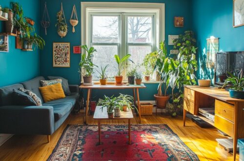
How to Choose the Best Paint Colors for Your Home Interior
The wrong paint color can undermine even the most thoughtfully designed room-a costly error that interior professionals see repeatedly. Selecting the ideal palette requires more than flipping through swatch decks; it demands a strategic evaluation of lighting, architecture, and emotional intent. This guide provides a systematic framework for confident color selection, covering spatial analysis, undertone mastery, and proven testing methods to ensure your final choice enhances every square foot.
Evaluate Natural Light Sources and Room Orientation
North-facing rooms get cool, gray light that makes colors appear darker and more muted, while south-facing rooms receive warm, bright light that enhances saturation, test your paint accordingly. This difference in color temperature can completely transform how your interior paint looks on the wall. A blue paint that feels crisp and airy in a south-facing room might feel cold and flat when placed in a north-facing space.
East-facing rooms enjoy warm, golden light in the morning, but the light shifts to a cooler tone by midday and evening. West-facing rooms are the opposite, they stay relatively neutral in the morning and then glow with warm, yellow light during the late afternoon. For west-facing rooms, consider warm tones like beige, greige, or soft yellow to complement the golden hour, while east-facing rooms pair nicely with neutral colors that can adapt to both morning warmth and afternoon shade.
To get a precise read on your lighting, download a light meter app like Lux Light Meter Free to measure the actual intensity in different areas of the room. Hold the phone at wall height, not at the floor, and take readings near windows and in the center of the room. This gives you concrete data to compare against sample swatches rather than guessing based on memory alone.
Make it a habit to observe your chosen wall color at three specific times: 9am, 12pm, and 5pm. The light at these hours changes dramatically, and a color that looks perfect at noon might feel dull or overly vibrant by evening. Take photos at each time and compare them side by side, this helps you spot undertones that only appear under certain lighting conditions.
Test Artificial Lighting and Its Color Temperature
Use a color temperature chart to match your bulbs (2700K warm, 3500K neutral, 5000K daylight) with your paint choice, wrong pairing can turn a ‘warm gray’ into a ‘cold gray’. The Kelvin scale measures the hue of light itself, not its brightness. Lower Kelvin numbers produce a cozy, yellowish glow, while higher numbers mimic crisp, blue-tinted daylight.
Your interior paint will look completely different under each type of bulb. A wall color that looks inviting under a warm bulb can appear sterile and flat under daylight bulbs. This is why testing your sample swatch at home, under your actual fixtures, is non-negotiable for a successful paint job.
| Color Temperature | Light Appearance | Effect on Paint |
|---|---|---|
| 2700K | Warm, soft yellow | Enhances reds, oranges, and yellows; makes neutral colors feel cozier |
| 3000K | Soft white | Balanced warmth; flatters greige and beige tones |
| 3500K | Neutral white | Renders colors accurately; good for transition zones |
| 4000K | Cool white | Adds crispness; can make warm tones look dull or muddy |
| 5000K | Daylight | Mimics noon sun; intensifies cool tones and blues |
Halogen bulbs naturally enhance warm tones, making reds and golds appear richer. In contrast, standard LED bulbs vary widely by brand, so check the Kelvin rating on the package rather than trusting the label. Philips Hue bulbs let you adjust the temperature on demand, which is ideal for testing multiple paint colors in one evening. GE Reveal bulbs filter out dull yellow light, which helps white paint look cleaner and brighter.
Set up a portable lamp with a warm bulb on one side and a cool bulb on the other. Hold your paint tester cards vertically against the wall, not flat on a table, to see how the light hits them at eye level. Move the lamp around the room to simulate different times of day and check for undertone shifts you might miss under store lighting.
Determine the Room’s Primary Purpose
For a home office, opt for focus-enhancing blues or greens, but for a dining room, warm reds or terracottas encourage appetite and conversation, based on color psychology studies. The function of each space should dictate your interior paint choices before you even consider aesthetics. Research from the University of Texas suggests that cool tones like blue and green can improve productivity and mental focus in work environments.
Start by listing how you use each room daily. A bedroom is for rest, so calming blues and soft greens are excellent wall color options that lower heart rate and promote sleep. In contrast, a kitchen benefits from energizing yellows or warm whites that feel fresh and inviting during morning routines. Bathrooms often feel best with spa-like blues and greens that evoke cleanliness and relaxation.
Be cautious with high-stimulation colors in rest areas. Bright reds, vivid oranges, and intense yellows can raise energy levels and create anxiety when used in bedrooms or cozy reading nooks. Save those bold colors for active spaces like a home gym, a playroom, or a creative studio where their vibrancy serves a purpose.
Consider how your lifestyle impacts each room. A living room used for quiet reading needs a different color palette than one used for lively family game nights. Match the mood you want to feel, not just the look you want to see. This simple exercise prevents costly repainting and ensures your color palette supports your daily routines from the moment you walk in.
Identify the Desired Emotional Atmosphere
Research shows that blue lowers heart rate and promotes calm, while red increases energy and appetite, so choose your emotional target first. The colors you surround yourself with daily have a measurable impact on your mood, productivity, and even your sleep patterns. Before you flip through paint swatches, take a moment to define how you want each room to feel when you walk through the door.
Studies published in the Journal of Environmental Psychology consistently link specific hues to distinct psychological responses. Cool tones like blue and green tend to reduce stress, while warm tones like yellow and orange can spark creativity and sociability. This makes color psychology a practical starting point for your interior paint selection, not just an abstract theory.
To clarify your vision, create a mood board using Pinterest or a design tool like Canva. Collect images of rooms, fabrics, and artwork that evoke the feeling you want, then look for common color threads across your selections. This visual exercise helps you separate personal preference from fleeting trends.
Take a moment to write down three words that describe the desired atmosphere for your home, such as serene, inviting, or energizing. Keep these words visible while you shop for paint, and let them guide every decision about your color palette and wall color.
| Color | Psychological Effect | Best Used In |
|---|---|---|
| Blue | Calm, focus, lower heart rate | Bedrooms, home offices |
| Yellow | Optimism, warmth, mental clarity | Kitchens, breakfast nooks |
| Green | Balance, restoration, connection to nature | Living rooms, bathrooms |
| Red | Energy, passion, increased appetite | Dining rooms, accent walls |
| Purple | Luxury, creativity, introspection | Bedrooms, creative studios |
| Neutral Gray | Sophistication, neutrality, flexibility | Open floor plans, hallways |
Keep in mind that saturation and undertone matter as much as the base color. A soft dusty blue feels entirely different from a vivid royal blue, even though both fall under the same family. When you evaluate your mood board, pay attention to whether the images lean toward muted, pastel versions or rich, bold versions of your target colors.
Your three descriptive words will also help you navigate the 60-30-10 rule later. The dominant wall color should reflect the primary emotion, while accent colors in decor and trim can introduce secondary feelings. This layered approach creates depth without overwhelming the senses.
Use Your Furniture and Fabrics as a Color Palette
Take a photo of your sofa or rug and use a color picker tool (e.g., Adobe Color) to extract 3-5 key colors, these will form your room’s palette. Free tools like Coolors or the eyedropper feature in design apps make this process quick and intuitive. Once you have your colors, you will notice they naturally harmonize because they already exist together in your favorite pieces.
Consider a real-world example: your rug features a blue-gray pattern with subtle cream accents. Use the blue-gray as your base for the wall color to create a calm foundation. Then pull the cream for your trim color or ceiling paint to brighten the space and add architectural interest.
To keep the room balanced, apply the 60-30-10 rule for color ratio. The dominant wall color should cover 60% of the room, your secondary furniture color takes up 30%, and the remaining 10% goes to accent pieces like throw pillows or artwork. This formula prevents any single hue from overwhelming the space.
Pay close attention to the undertones in your fabrics, as they dictate the overall color temperature. A beige sofa with warm yellow undertones pairs best with warm wall colors, while a gray couch with cool blue undertones calls for cooler paint finishes. If you ignore these subtle hints, your wall color may clash even if the main colors seem compatible.
Incorporate Artwork and Decor as Starting Points
Pull a dominant color from a large piece of art to create an accent wall, this ties the room together and adds visual interest. Artwork often contains a color palette that already works harmoniously, so you can trust it as your guide. A painting, tapestry, or even a patterned rug can serve as the anchor for your entire room’s scheme.
Start by identifying the hue that appears most frequently or stands out the most in your chosen piece. This becomes your accent wall color, while secondary tones can inform your larger wall color and trim color. For example, if you have a landscape painting with a teal sky, paint one wall teal and use neutral beige for the rest. This approach creates a cohesive look without overwhelming the space.
Create a Pinterest board or physical mood board to gather images of rooms that feature similar artwork and color combinations. This helps you visualize how different wall color options might interact with your decor before committing. You can also photograph the artwork and use a color matching tool at your local paint store to find the exact hue.
This technique is a favorite among professionals, including those at Farrow & Ball, who use it during color consultations. They recommend pulling from existing pieces to ensure the interior paint feels intentional rather than random. Your decor becomes the foundation, and the paint simply enhances what is already there.
Learn Basic Color Harmonies (Complementary, Analogous, Monochromatic)
Complementary colors (opposite on the wheel) like blue and orange create high contrast, while analogous colors (next to each other) like blue and green offer harmony, use them strategically. These three classic harmonies form the backbone of any successful interior paint strategy. Understanding how they interact helps you make confident choices for your wall color and accent pieces.
Complementary schemes pair opposites like blue with orange or red with green. This pairing produces maximum visual energy, making each hue appear brighter. Use complementary colors for accent walls or bold accessories, not for entire rooms. A deep navy accent wall against warm terracotta decor creates a striking focal point without overwhelming the space.
Analogous colors sit side by side on the color wheel, such as blue, green, and teal. These neighbors naturally blend together, creating a calm and cohesive atmosphere perfect for bedrooms and reading nooks. Because the colors share similar undertones, they transition smoothly across trim color, baseboard, and wall surfaces. This palette works beautifully in open floor plans where you want color flow between adjacent rooms.
Monochromatic schemes use one single hue at different levels of saturation and lightness. Think pale sky blue walls with navy furniture and soft powder blue textiles. This approach delivers understated elegance and sophistication that never feels dated. It also makes small rooms appear larger since there are no jarring color breaks to interrupt the eye.
To visualize these harmonies, use Canva’s free Color Wheel tool or create a simple mood board on Pinterest. Apply the 60-30-10 rule: 60% dominant wall color, 30% secondary furniture or flooring color, and 10% accent details. For complementary schemes, use the bold pairing in that 10% accent portion only. For analogous and monochromatic palettes, you can extend the harmony across larger surfaces while keeping the ratio balanced.
Decode Warm vs. Cool Undertones in Paint Samples
A ‘white’ paint can have a pink, yellow, or blue undertone-check by holding a sample next to a pure white sheet of paper. This simple trick reveals the hidden color cast that might not be obvious on the tiny swatch card. The white paper test works because it gives your eye a true neutral reference point, making the undertone instantly visible.
Once you spot the undertone, categorize it as warm or cool. Warm undertones include yellow, red, and orange, while cool undertones lean toward blue, green, and purple. A warm white will feel creamy and inviting, perfect for cozy living rooms. A cool white feels crisp and fresh, which suits bathrooms and modern kitchens.
Compare your sample to a known neutral like Benjamin Moore’s Simply White to sharpen your eye. Simply White reads as a true white with a barely-there warm cast, making it an excellent benchmark. Sherwin-Williams ‘Agreeable Gray’ has warm greige undertones, blending gray with beige for a soft, inviting feel. In contrast, ‘Repose Gray’ sits cooler with a more neutral gray profile that feels sharper and more contemporary.
If you still feel uncertain, consider booking a color consultation with an interior designer or using a paint brand’s online color service. Many brands offer virtual tools where you upload a room photo and test colors directly. Experts recommend trusting your instincts but verifying with large sample swatches before committing to a full gallon. Paint a large poster board and view it in different lighting conditions throughout the day.
Create a Cohesive Palette Across Connected Rooms
Use a base neutral like Sherwin-Williams ‘Alabaster’ for hallways and transition zones, then vary accent colors in each room for a unified yet distinct feel. This strategy creates a visual thread that ties your entire home together without making every space look identical. The key is to establish a consistent foundation while allowing each room to express its own personality.
Choose one neutral as your anchor, then use different accent colors in each room while keeping the same undertone throughout. If you select warm-toned neutrals, stick with warm accent colors like terracotta, olive green, or golden yellow. For cool-toned palettes, lean into blues, sage greens, or soft lavenders. This consistency prevents jarring transitions when you move from one space to another.
A practical example: paint your living room in Sherwin-Williams ‘Agreeable Gray’ and your dining room in ‘Accessible Beige’. Both colors share warm undertones, so they flow beautifully together even though they are different hues. This approach is a favorite among interior designers like Emily Henderson, who often pairs warm greiges with soft cream accents for a relaxed yet polished look.
Pay close attention to color flow in open floor plans. When rooms connect visually, the wall color in one space directly impacts how the next room appears. Test your chosen neutrals side by side on the same wall to confirm they complement each other under your natural light and artificial lighting conditions. This simple step prevents clashing undertones that can make a home feel disjointed.
Decide Between Open-Concept vs. Individual Room Schemes
In open-concept spaces, use the same wall color for the main walls to create flow, but use an accent wall or trim color to define separate zones without visual breaks. This approach keeps the eye moving naturally from the kitchen into the living area without a jarring shift in color temperature. The goal is a single color palette that feels intentional, not repetitive.
For open floor plans, start with one main color for the largest wall surfaces. Then introduce variation through furniture color, area rugs, and decorative accents rather than changing the paint color every few feet. Consider using a slightly different ceiling paint in each zone to subtly define the dining area from the lounge space. This trick adds architectural interest without disrupting the overall cohesive look.
Individual rooms offer more freedom to experiment with bold colors and distinct moods. A home office can handle a deep green or navy, while a powder room might benefit from a dramatic black accent. The key is to maintain a cohesive theme through shared undertones or a consistent trim color. If you use warm tones in the hallway, carry that warmth into adjacent rooms even if the wall color changes completely.
Consider a real-world example of a home with an open floor plan. The owners chose a soft greige for the main living walls, a warm white for the kitchen cabinetry, and a muted blue on a single accent wall behind the sofa. This created clear visual zones without any physical barriers. The dining area was defined by a slightly darker ceiling paint, while the trim color remained consistent throughout, tying every space together seamlessly.
Use Large Swatches and Paint Samples on Multiple Walls
Buy sample pots (like Sherwin-Williams’ 8-oz samples for $7) and paint 2×2-foot sections on at least two walls, one near a window, one in a darker corner. Small swatch cards simply cannot show you how a color will truly behave in your space. The lighting, the room size, and even the furniture color all change how a wall color appears throughout the day.
When you buy samples, expect to pay around $5 to $10 per pot depending on the brand. Benjamin Moore samples typically cost about $10, while Sherwin-Williams runs near $7, and Behr is usually around $5. This small investment is worth every penny compared to the cost of painting an entire room with the wrong color.
To get accurate results, follow a simple process. First, prime the areas where you plan to test, especially if the current wall color is dark or bold. Second, paint your large swatches using a roller to match the final texture, and third, label each section with the color name and brand so you can keep track.
Remember that a small swatch is not enough because paint looks different at scale. A 2×2-foot section lets you see the true undertone and how the color interacts with your natural light and artificial lighting. You can also use a paint calculator, such as Sherwin-Williams’ online tool, to estimate how much interior paint you will need for the full project once you make your final decision.
Observe Colors at Different Times of Day
View your painted samples at 9am (morning light), 3pm (afternoon), and 8pm (artificial light) to see how the color shifts, this mirrors real-life usage. Morning sunlight has a cool, blue cast that brightens cool tones and makes warm tones appear softer. By afternoon, the sun is warmer and more intense, which can make yellows and oranges glow while muting some blues and grays.
Evening brings a completely different scenario. Standard artificial lighting from ceiling fixtures and lamps tends to have a yellow or amber hue, which can make a wall color look richer and more saturated. A color that looked crisp and airy during the day might feel heavy or muddy at night. This is why relying on a single daytime glance often leads to disappointing results.
Create a simple observation checklist to track your findings. At each time slot, note whether the color feels warmer, cooler, brighter, or darker than expected. Take photos with your phone at each interval so you can compare them side by side later, but remember that phone cameras can slightly distort color accuracy.
For a more precise test, use a portable lamp with interchangeable bulbs to simulate different lighting conditions. Swap between a daylight bulb (5000K), a soft white bulb (2700K), and a warm LED bulb to see how your paint reacts. This simple trick helps you predict whether your wall color will look consistent in the kitchen, the hallway, and the bedroom, where lighting fixtures vary greatly.
Work with Trim, Molding, and Built-Ins
If you have classic white trim, choose wall colors that complement it-like Sherwin-Williams ‘Pure White’ for a crisp look or ‘Alabaster’ for warmth. White trim acts as a neutral anchor, allowing your wall color to take center stage without competing for attention. This combination works with nearly any hue, from soft neutrals to bold jewel tones.
For a more dramatic approach, consider dark trim such as black or charcoal. Dark trim frames your walls and creates a striking contrast that adds depth and architectural interest. This works especially well in rooms with high ceilings or large windows, where the bold framing feels intentional rather than heavy.
Built-ins deserve special attention when planning your color palette. Painting built-in shelving or cabinetry a contrasting color, like navy or deep green, transforms them into a focal point. This technique adds visual weight and gives the room a custom, designer feel without requiring major renovations.
Don’t overlook crown molding and wainscoting when selecting your interior paint. These architectural features catch light and cast shadows, so their color directly affects how your wall color reads. Lighter molding makes ceilings feel higher, while darker wainscoting grounds a room and adds a sense of stability. Test your trim color alongside your wall color using sample swatches to see how they interact in your actual lighting conditions.
Coordinate with Flooring, Countertops, and Tiles
Hardwood floors with warm oak tones call for warm wall colors, while cool gray tiles pair best with cool hues, use a color match app to extract tones. The fixed elements in your room, like flooring and countertops, should anchor your entire interior paint selection. When these surfaces feel cohesive with your wall color, the whole space looks intentional and polished.
Start by identifying whether your flooring leans warm or cool. Oak, cherry, and walnut floors carry warm undertones, so pair them with beige, cream, or warm greige walls. On the other hand, gray tile, slate, or whitewashed wood reads cool, making blue-gray or soft gray wall colors a natural match. This simple color temperature pairing prevents visual clash and creates a calm backdrop.
For kitchen countertops, the process is more hands-on. Take a physical sample of your granite, quartz, or marble to the paint store and hold it against paint swatches. Granite with gold and brown flecks pairs beautifully with warm white or soft taupe, while countertops with gray veining call for cool whites or pale blue-gray tones. Seeing the materials side by side under store lighting removes guesswork.
Technology can simplify the matching process even further. Apps like ColorSnap from Sherwin-Williams let you photograph your countertop or floor and generate complementary paint colors instantly. You can also upload a photo of your tile backsplash to find a wall color that ties the whole kitchen together. These tools are especially helpful when you cannot carry heavy samples around.
Consider a real-world example to guide your decision. Imagine a kitchen with warm beige granite countertops, honey-oak cabinets, and travertine tile flooring. A soft cream or warm greige wall color will harmonize with all three surfaces, making the room feel warm and inviting. Choosing a cool gray in this scenario would fight the warm undertones and make the space feel disjointed.
Steer Clear of Overly Trendy or Oversaturated Colors
Trendy colors like millennial pink or living coral may date quickly, so opt for timeless shades like Benjamin Moore’s Classic Gray for long-term appeal. Pantone’s Color of the Year picks, including Rose Quartz, Greenery, and Ultra Violet, often look dated within a few seasons. These bold choices can feel exciting at first, but they rarely stand the test of time in a home.
Oversaturated colors can overwhelm a space and make it feel smaller or more chaotic. High-intensity hues like bright red, electric blue, or vivid orange demand constant visual attention, which can create visual fatigue. Instead of committing to these loud shades on all four walls, consider using them sparingly on an accent wall or in accessories you can easily swap out.
Timeless neutral colors such as Agreeable Gray by Sherwin-Williams, Revere Pewter by Benjamin Moore, and Simply White by Benjamin Moore offer lasting appeal. These shades adapt well to changing furniture color and flooring color trends, and they work with both warm tones and cool tones. A neutral color palette also provides a calm backdrop that lets architectural features like crown molding and wainscoting shine.
When considering resale value, neutral walls are a smart investment. Research suggests that 80% of real estate agents recommend neutral wall colors to sellers looking to attract more buyers. Bold or niche colors can alienate potential buyers who envision their own style in the home, while a soft greige or warm white appeals to a broader audience.
Don’t Ignore the Impact of Ceiling and Trim Colors
A stark white ceiling can make a room feel shorter; consider a soft tint of your wall color to create height and cohesion. When you paint the ceiling a lighter version of the wall color, the eye moves upward without a harsh visual stop. This simple trick makes the space feel more expansive and connected.
Darker ceiling colors visually lower the ceiling height, which can create a cozy, intimate atmosphere in large rooms. However, this approach can make a small room feel like a cave. Experts recommend reserving darker ceiling shades for spaces with tall ceilings or for dramatic powder rooms.
For trim, pure white offers a crisp contrast that highlights architectural details like baseboards and crown molding. Yet, a warm white such as Alabaster by Sherwin-Williams is more forgiving with off-white walls. It softens the transition between surfaces and hides minor imperfections better than stark bright white.
Remember that door and window frames are part of your trim scheme. They should share the same trim color to create a unified look throughout the room. Benjamin Moore offers Ceiling White, a dedicated ceiling paint with a flat finish that minimizes glare and surface flaws.
When selecting trim paint, consider the paint finish carefully. Semi-gloss is the standard choice for trim because it is durable and easy to wipe clean. The subtle sheen also catches natural light, which adds depth to the architectural lines of your interior paint scheme.
Narrow Down to Two Finalists and Compare Side-by-Side
Paint large sections of each finalist color on the same wall, then live with them for 48 hours-this is the ultimate test. Use a roller to apply two 2×2-foot sections side by side on the wall. This gives you a true sense of how each wall color behaves in your actual space, not just on a tiny sample swatch.
Make sure both sections receive the same amount of natural light and artificial lighting. Observe the colors for two full days to capture different times of day. Morning light, afternoon sun, and evening lamp glow will all reveal different undertones and color temperature shifts. What looks like a warm beige at noon might turn cold and gray by nightfall.
Compare the two options at breakfast, lunch, and dinner time. Take note of how the paint finish and sheen interact with your lighting fixtures. Move furniture or flooring samples near the painted sections to see how the colors work with your existing decor. This side-by-side method prevents costly mistakes and helps you commit with confidence.
Use a color matching tool like Sherwin-Williams ColorSnap to verify the final color matches your vision. Many paint brands offer free sample pots so you can test without buying a full gallon. You can also request a color consultation at Benjamin Moore or Sherwin-Williams stores, where experts can help you analyze undertones and color flow with adjacent rooms. This professional guidance often reveals subtle differences you might miss on your own.
Trust Your Instincts and Visualize the Finished Room
If you keep coming back to one color, trust that-your instinct often reflects your daily needs and personal style. That pull toward a particular hue is rarely random. It is your brain recognizing how that color makes you feel in the context of your space, your furniture, and your lifestyle.
Before you buy anything, take time to visualize the finished room. Close your eyes and walk through the space mentally. Picture your sofa, your flooring, and the way sunlight hits the walls at different times of day. If you struggle with mental imagery, use a virtual room painter tool like the Sherwin-Williams ColorSnap Visualizer. Upload a photo of your room and test several interior paint colors in minutes.
These digital previews are not perfect, but they help you see the overall color palette in context. They show how a wall color interacts with your existing furniture color and flooring color. This step often confirms your gut feeling or reveals that a shade is too dark or too saturated for the room size.
Remember that paint is not permanent. If the color feels wrong after a week, you can repaint. Interior designer Sarah Thompson puts it simply: “Your home should reflect your personality, not a trend.” A bold color that makes you happy is better than a neutral color that feels safe but uninspired.
Before you head to the store, run through this quick checklist to avoid costly mistakes:
- Have you tested the color with a sample swatch or paint tester on at least two walls?
- Have you viewed the color under natural light, artificial lighting, and at night?
- Does the color work with your furniture color, flooring color, and cabinetry?
- Have you considered the undertone and how it pairs with adjacent rooms?
- Does the paint finish (matte, eggshell, satin) match the room’s function?
- Are you choosing a low-VOC paint for better indoor air quality?
Taking these final steps ensures your chosen color flows well with the rest of your home. Trust your taste, but verify it with a quick digital preview and a physical sample. This balance between instinct and preparation will give you a cohesive look you will love for years.
1. Assess Your Current Space and Lighting
Before picking a paint color, assess your room’s natural light orientation and the color temperature of your artificial bulbs, this will dramatically affect how your chosen hue appears on the walls. A color that looks soft and airy in a sunlit showroom can turn flat and dull in a dim hallway. Lighting is the single most influential factor in how your interior paint will be perceived.
Natural light changes color perception throughout the day. Morning sun casts a cooler, bluish glow, while afternoon light brings out warm golden tones. A wall color like a pale blue might look crisp at noon but appear gray and moody by evening. North-facing rooms receive cool, consistent light, which can make warm tones look richer, while south-facing rooms get bright, warm light that can wash out lighter shades.
Artificial lighting adds another layer of complexity. Warm bulbs with a low color temperature (around 2700K) enhance reds, oranges, and yellows, making a room feel cozy. Cool bulbs (5000K or higher) mimic daylight and can make colors appear sharper and more blue. Your lighting fixtures and their bulb choices will shift the undertone of every color you select.
Take time to observe your room at different hours before committing to a palette. Note where shadows fall, which corners stay dark, and how your existing furniture color interacts with the light. This simple assessment saves you from costly repaints and ensures your chosen wall color performs beautifully from morning to night.
2. Define the Mood and Function of Each Room
How do I want to feel when I enter this room? That single question is the foundation of every successful interior paint project. The answer will guide your color choices, whether it’s calming blue for a bedroom or energizing yellow for a kitchen.
Color psychology plays a significant role in how we perceive and interact with spaces. Warm tones like red, orange, and yellow tend to feel stimulating and social, while cool tones like blue, green, and purple promote relaxation and focus. Your goal is to match the emotional response of the wall color with the daily activities that happen in that room.
Before you look at any sample swatch, write down the primary function of each space. A living room might be for entertaining guests, while a home office is for deep concentration. The paint finish and hue should support that purpose, not fight against it. For example, a high-traffic hallway benefits from a durable satin finish, whereas a quiet reading nook can handle a delicate matte finish.
Once you define the mood, the rest of your decisions become easier. You will know whether to explore bold colors or stick with neutral colors, and whether to choose a high-contrast palette or a monochromatic scheme. This clarity prevents costly mistakes and ensures every room feels intentional, not accidental.
3. Draw Inspiration from Existing Elements
Your room already has a story-your sofa, rug, and favorite painting can serve as the perfect starting point for a cohesive color scheme. Instead of starting from scratch, look at the pieces you already love and let them guide your interior paint choices. This approach is a favorite among interior designers because it ensures harmony without guesswork.
Using existing elements saves you money and reduces waste. You won’t need to replace furniture or accessories to make a new wall color work. Instead, the wall color, trim color, and even the paint finish will be chosen to complement what you already own.
Start by identifying the dominant color in your largest piece, such as a sofa or area rug. Pull two or three secondary shades from the same item to build your color palette. These can become your wall color, accent wall, or baseboard color.
Look closely at the undertones in your existing pieces. A beige sofa might have warm yellow undertones or cool gray undertones. Matching those undertones in your paint will create a seamless, cohesive look that feels intentional and polished.
4. Understand the Color Wheel and Undertones
Mastering the color wheel and undertones is essential, it helps you predict how colors interact and avoid ending up with an unintended mismatch. The color wheel organizes hues by their relationships, showing you which colors naturally harmonize and which ones create contrast. This simple tool is the foundation for building a cohesive color palette that flows from room to room.
When you look at a paint chip, the undertone is the subtle hue hiding beneath the main color. A white paint, for instance, might carry a hint of blue, green, or yellow. These hidden hues are often invisible in the store but become obvious once the paint is on your walls and exposed to your natural light.
Understanding undertones prevents the classic mistake of pairing a warm beige with a cool gray, which can clash instead of complement. The goal is to match the undertones of your wall color with your furniture color, flooring color, and even your cabinetry. When all the undertones agree, your space feels intentional and calm.
Before you fall in love with a color, always test it at home. Use a sample swatch and paint a large section of your wall to see how the undertone shifts with your artificial lighting and lighting fixtures. This small step saves you from repainting an entire room after a costly mistake.
5. Choose a Color Strategy for Your Home’s Flow
A cohesive color flow makes your home feel larger and more intentional, whether you choose a single palette throughout or distinct schemes for each room. When colors harmonize from one space to the next, your eye moves smoothly without jarring stops. This creates a sense of calm and polish that individual room choices alone cannot achieve.
Open floor plans demand more careful coordination because multiple zones share the same sightlines. A kitchen, dining area, and living room that flow together need wall colors that complement each other rather than clash. If you use a bold color in one zone, consider carrying a softer version of that same hue into the adjacent space.
For homes with separate rooms and doorways, you have more freedom to change palettes. However, you should still consider what you see when doors are open. Transition zones like hallways and staircases act as bridges, so their colors should relate to the rooms they connect.
Think about your furniture color, flooring color, and natural wood tones as part of the flow. These fixed elements stay constant, so your wall colors need to work with them in every room. A warm wood floor in a hallway will influence how cool gray paint appears in adjoining bedrooms.
6. Test Paint Colors Effectively Before Committing
Testing paint colors on your walls is essential, a small swatch won’t show the truth; you need large samples and time to observe them. Professional designers always test before finalizing a color palette because paint changes dramatically with light and time of day.
A tiny chip on a card tells you almost nothing about how the wall color will feel in your actual room. The surrounding surfaces, your flooring color, and even your furniture color all influence how the interior paint appears on the wall.
Invest in sample pots of paint rather than relying on printed color cards. Paint a generous area, at least two feet square, directly on the drywall to see the true undertone and saturation before you commit.
Remember that paint finish matters during testing. Test the same color in both a matte finish and an eggshell finish to see how the sheen changes the perception of the hue. The reflection from a satin finish can make a color look lighter and more vibrant than the same color in a flat paint.
7. Consider Architectural Features and Fixed Elements
Your room’s fixed elements, trim, flooring, and countertops, should influence your paint choice to create a harmonious whole. These features are permanent and costly to replace, so your wall color must work with them. Trying to fight your architecture often leads to a disjointed and stressful space.
Start by identifying the undertones in your fixed elements. A beige carpet with pink undertones will clash with a green wall paint that has yellow undertones. Likewise, cool gray countertops in a kitchen demand a wall color with similar cool undertones to feel cohesive.
Your trim color and baseboard act as a frame for your walls. A crisp white trim offers a clean contrast to bold colors, while a warm cream trim pairs better with earthy tones. If you have natural wood window frames or crown molding, pull a muted tone from the wood grain for your wall color.
Flooring is often the largest surface in a room. Match your wall color to the dominant tone in your floor, not the exact shade. For example, red-toned hardwood pairs beautifully with warm greige or soft sage green, while gray luxury vinyl plank flooring looks best with cool blues or crisp whites.
8. Avoid Common Color Selection Mistakes
Many homeowners regret color choices because they followed trends or ignored ceiling and trim. Learn from these common pitfalls before you pick up a brush. Mistakes are costly and time-consuming, often requiring multiple coats or a full repaint.
Avoiding these errors saves money on extra paint and primer. It also preserves your sanity and keeps your schedule on track. Planning ahead is far cheaper than fixing a failed color palette after the fact.
One frequent mistake is choosing a wall color without testing it in your actual lighting. A sample swatch on the wall is your best defense against surprises. Natural light and artificial lighting change how any hue appears throughout the day.
Another error is ignoring the undertones in your paint. Beige can lean pink or yellow, and gray can shift blue or green. Always compare your chosen color to your flooring and furniture color to ensure a cohesive look.
9. Finalize Your Choice with Confidence
After testing and evaluating, it’s time to commit-narrow down to two finalists and trust your instincts. You have done the hard work of comparing sample swatches, observing color shifts under natural light and artificial lighting, and considering how each hue interacts with your furniture color and flooring color.
Lay both finalists side by side in the room for one last look. Pay attention to the undertone of each wall color during different times of day. The right choice should feel like a natural extension of your space, not a forced decision.
Remember that a paint color is never a permanent commitment. A fresh coat of interior paint is one of the easiest updates you can make to your home. If the color feels slightly too bold or too subtle after application, you can always adjust the saturation or switch to a lighter version of the same hue.
Trust the process you have followed, from the color wheel to the paint tester. Your careful evaluation of color psychology, room size, and architectural features has prepared you well. When you feel that moment of certainty, move forward with confidence and enjoy the transformation.